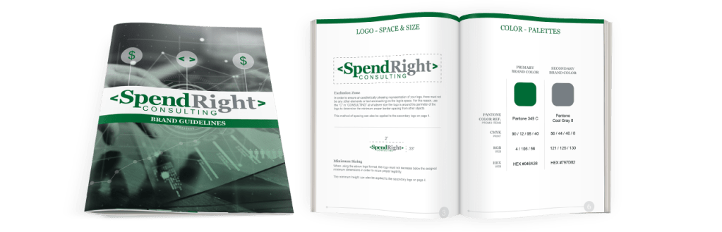
The SpendRight Consulting brand refresh project we received was a straight forward project that my manager assigned me to train my two junior designers how to work on a branding project.
The brief asked for a wordmark logo with a typewriter font, the <> symbols, and the specific green and gray. The three of us worked together to design a number of options, then reduced the options down to two and my logo was the one chosen.
While I was setting up the basic template for the brand guidelines, I had one of them find and create the imagery for the cover. Once the bones were set up, I walked them through how to make a brand book and what information is necessary in a simple one, like we were creating, and what you might add to a more complex one.
From there, there were three final pieces of collateral that they requested as part of their branding package. I assigned my most junior designer the business cards to work on as she hadn’t worked on any yet.
My other designer was training web design, so I assisted her when she had questions and when she needed to use code to get her desired results. To make her job easier I did choose a web safe font for the logo.
The final piece was two adjustable trade show x frames that they wanted to be versatile. They wanted a design that matched but could work separately due to the different topics of trade shows they would attend and they wanted a design that worked at both standing and tabletop booths. Due to these requirements I created a paneled design with the most important information in the first two panels where they would be visible at tabletop shows.